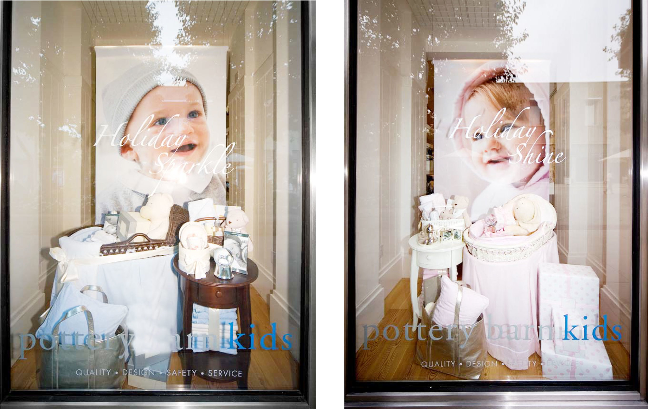
BRANDING, PACKAGE DESIGN AND BRAND GUIDELINES
In an effort to help Memorex grow market share in Latin America, I was brought on board to art direct the redesign the product line’s current packaging.
The previous state of the package followed strict guidelines – clean white packaging with multicolor type – which worked well within the US/Canada market. However, in Latin America a redesign was required to bring life to the product on the regional shelf sets - and to target a younger crowd based on the lower price point.
Working closely with a team consisting of a Product Manager, Global Marketing, Packaging Engineer, and the Global Creative Director we developed a bright, colorful and beautiful line of packaging to highlight the headphone line. We introduced a distinctive shape to the packaging and brought the Memorex multi-color palette forward. Referencing the classic Memorex "Is It Live, or Is It Memorex" campaign, we gave the product line a new name called “Memorex Live”.